Modal Component
Modal Component
Section titled “Modal Component”- Appears in the center of the screen with a nice animation
- Can be closed by clicking the close button or outside the modal
- Can be used to display content in a modal
Example 1: Modal with header, subheader, and a button
Section titled “Example 1: Modal with header, subheader, and a button”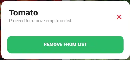
- Start with the skeleton below and place your UI elements inside the
.contentcontainer. - The
manu-box-modalclass is used to style the modal.
<!--menu_crops_tomato_modal--><div id="menu_tomato_modal" class="menu menu-box-modal menu-box-detached rounded-m d-block" data-menu-effect="menu-over"> <div class="menu-title mt-n1"> <h1 id="text_tomato_header" class="ankur_language">Tomato</h1> <p id="text_tomato_subHeader" class="color-theme opacity-50 ankur_language"> Proceed to remove crop from list </p> <a href="#" class="close-menu"><i class="fa fa-times"></i></a> </div> <div class="divider mt-0 mb-0"></div> <div class="mb-0 mt-3 text-center"> <div class="mb-3 mt-2 me-2 ms-2"> <a href="#" id="button_crops_tomato" data-click='{"operation" : "function", "function_name" : "crops_grown_tomato", "reset" : false, "locked" : false}' class="ankur_language ankur_btn_1 btn btn-full btn-m font-700 text-uppercase rounded-sm shadow-l bg-grass-dark ms-2 me-2 app-nursery-click" >Remove from List</a > </div> </div></div>Trigger
Section titled “Trigger”- Attach a modal to any element by setting the
data-clickattribute to callshow_menuwith the menu name.
<a href="#" id="button_tomato_modal" data-click='{"operation" : "show_menu", "menu_name" : "menu_tomato_modal", "reset" : false, "locked" : false}' class="card card-style mx-0 mb-3 app-nursery-click"> <div class="p-3"> <h4 class="mb-0 font-15">Tomato</h4> </div></a>Example 2: Modal with header, subheader (Larger), and a button
Section titled “Example 2: Modal with header, subheader (Larger), and a button”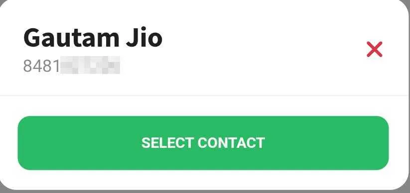
- Start with the skeleton below and place your UI elements inside the
.contentcontainer. - The
manu-box-modalclass is used to style the modal.
<!--menu_select_contact_modal--><div id="menu_select_contact" class="menu menu-box-modal menu-box-detached rounded-m d-block" data-menu-effect="menu-over"> <div class="menu-title mt-n1"> <h1 class="ankur_language" id="text_contact_header">Select Contact</h1> <p class="color-theme opacity-50 ankur_language" style="font-size: 14px !important; margin-top: -12px !important" id="text_contact_subheader" > Review contact details below </p> <a href="#" class="close-menu"><i class="fa fa-times"></i></a> </div> <div class="divider mt-0 mb-0"></div> <div class="mb-0 mt-3 text-center"> <div class="mb-3 mt-2 me-2 ms-2"> <a href="#" id="button_select_contact" data-click='{"operation" : "function", "function_name" : "phonebook_select_contact_confirm", "reset" : false, "locked" : false}' class="ankur_language ankur_btn_1 btn btn-full btn-m font-700 text-uppercase rounded-sm shadow-l bg-grass-dark ms-2 me-2 app-nursery-click" >Select Contact</a > </div> </div></div>Trigger
Section titled “Trigger”- Attach a modal to any element by setting the
data-clickattribute to callshow_menuwith the menu name.
<a href="#" id="button_select_contact_modal" data-click='{"operation" : "show_menu", "menu_name" : "menu_select_contact", "reset" : false, "locked" : false}' class="card card-style mx-0 mb-3 app-nursery-click"> <div class="p-3"> <h4 class="mb-0 font-15">Select Contact</h4> </div></a>