Dependent Toggle
The Component
Section titled “The Component”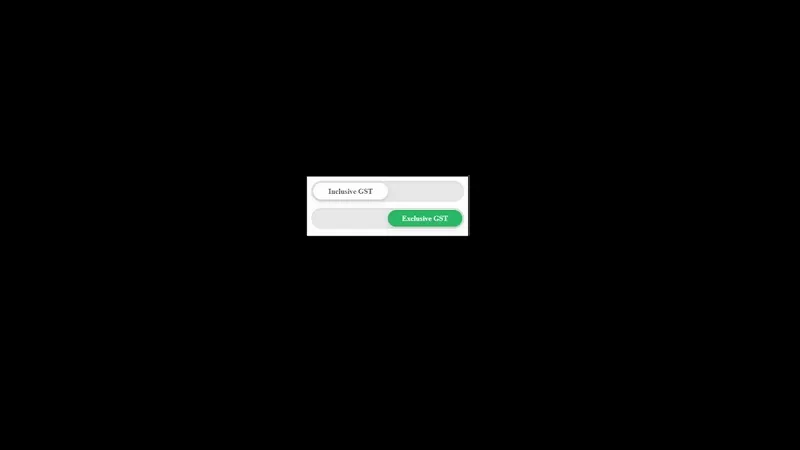
<div class="depend-toggle-group mb-3" data-depend-group="gst-mode">  <!-- Inclusive GST -->  <div class="depend-toggle-switch">    <input      type="radio"      name="gst_mode"      id="depend_gst_incl"      class="depend-toggle-radio"      value="inclgst"      checked    />    <label for="depend_gst_incl" class="depend-toggle-label">      <div class="depend-toggle-button">        <span class="depend-toggle-text">Inclusive GST</span>      </div>    </label>  </div>
<!-- Exclusive GST --> <div class="depend-toggle-switch"> <input type="radio" name="gst_mode" id="depend_gst_excl" class="depend-toggle-radio" value="exclgst" /> <label for="depend_gst_excl" class="depend-toggle-label"> <div class="depend-toggle-button"> <span class="depend-toggle-text">Exclusive GST</span> </div> </label> </div></div>/* Dependent Big Toggle Switch (Radio)*/
.depend-toggle-group { width: 100%; display: grid; gap: 12px;}
.depend-toggle-switch { /* Local variables */ --ts-track-bg: #e8e9ea; --ts-track-shadow: inset 0 2px 4px rgba(0, 0, 0, 0.06); --ts-btn-bg: #ffffff; --ts-btn-text: #6c6c6c; --ts-btn-shadow: 0 4px 12px rgba(0, 0, 0, 0.1), 0 2px 4px rgba(0, 0, 0, 0.05);
width: 100%; display: block; position: relative; box-sizing: border-box;}
/* Hide default radio */.depend-toggle-switch .depend-toggle-radio { display: none;}
/* The Track */.depend-toggle-switch .depend-toggle-label { display: block; width: 100%; height: 40px; background-color: var(--ts-track-bg); border-radius: 999px; position: relative; cursor: pointer; box-shadow: var(--ts-track-shadow); padding: 4px; box-sizing: border-box; -webkit-tap-highlight-color: transparent;}
/* The Floating Button */.depend-toggle-switch .depend-toggle-button { position: absolute; top: 4px; left: 4px; width: calc(50% - 4px); height: calc(100% - 8px); background-color: var(--ts-btn-bg); border-radius: 999px; box-shadow: var(--ts-btn-shadow); transition: transform 0.4s cubic-bezier(0.4, 0, 0.2, 1);
display: flex; justify-content: center; align-items: center; z-index: 2;}
/* Typography */.depend-toggle-switch .depend-toggle-text { color: var(--ts-btn-text); font-size: 14px; font-weight: 700; user-select: none;}
/* Active State Logic */.depend-toggle-switch .depend-toggle-radio:checked + .depend-toggle-label .depend-toggle-button { transform: translateX(100%); background-color: #2aba66;}
.depend-toggle-switch .depend-toggle-radio:checked + .depend-toggle-label .depend-toggle-text { color: #ffffff !important;}document.addEventListener("change", function (e) { const radio = e.target; if (!radio.classList.contains("depend-toggle-radio")) return;
// radio.value is what you send to API console.log(radio.value);});
// Optional: log initial selected value on page load (useful for first API call)window.addEventListener("DOMContentLoaded", () => { const selected = document.querySelector('input[name="gst_mode"]:checked'); if (selected) console.log(selected.value);});